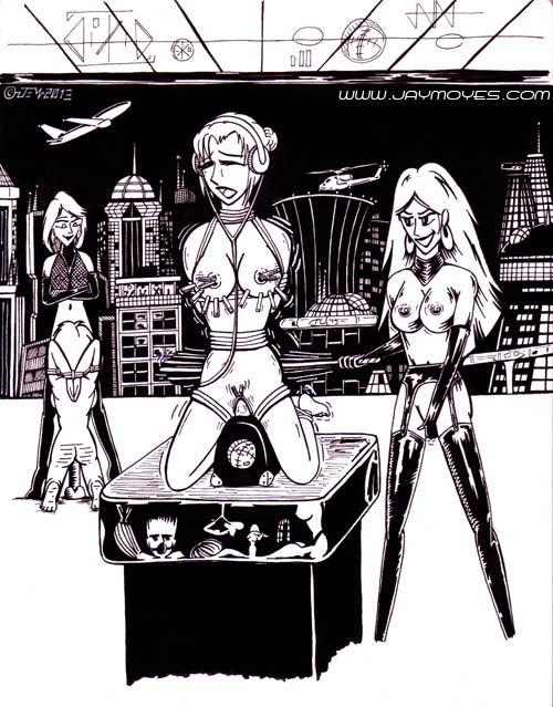
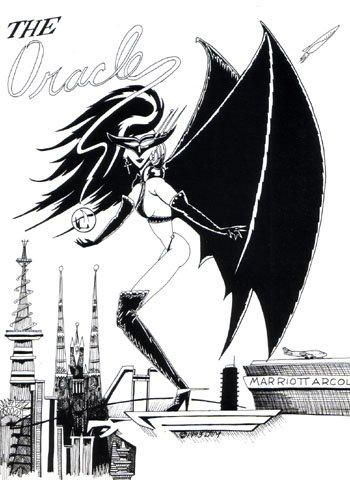
Obviously I’m having a better weekend than I thought. I finished this off this morning. While I’m having thoughts of additional touch ups and am curious to see what it looks like in color, I reached that stage where I’m close to the boundaries of the BDSM art piece.
Last night, I had an overwhelming urge to frame it. This is one of those moments where I feel like inviting all my friends to have a look at it. I couldn’t think of why, and it dawned on me. I don’t have many pieces with a lot of black work.
I specialized pen and ink for a reason. I was aiming for low budget zines and publications. At the year 2000, even AVN was published with only a portion of full color. Half the magazine was printed with black in, with an additional red, blue or green to jazz up some sections. Some BDSM publications only had a full cover color. Zines were worse.
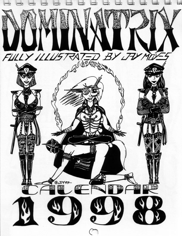
Most of The Dominatrix Calendars were done on a high end copier, but even now and then I had to fill in spots with a sharpie.
Most zines were printed by photocopier. Photocopiers are very tricky and demanding, even today. Pencil sketches came out awful. Colors translated poorly into black and white. Even “tones,” those tiny mechanical dots you see so often in comic books and comic strips, used to make grey areas, came out muddy on a copier. So pen and ink was perfect for zines and small presses.
But big black fields pose a problem for copiers. Only a few photocopiers did well with rich blacks and deep black fields. You’d get these faded white spots where the toner didn’t take. So a good artist did fills with cross hatching, stippling, and posterizing. When self publishing, I was able to brave black fields only when I had access to a damned good copy machine, like a new Zerox, or an old strobe machine like Kodak. It sounds ridiculous, but I still feel emotional that Kodak stopped making copiers.
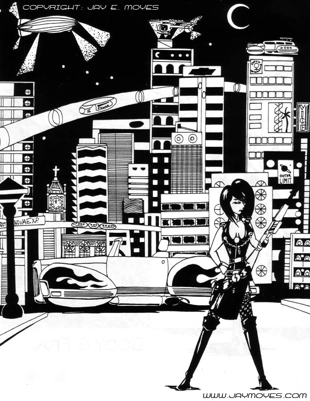
This is an old, old piece. I’m still laughing at those nipple piercings. Notice while there are more black fields, you’ve also got a lot of buildings with white space. I’m not gonna say this is my best work, but I do admit there was a lot of work that went into this drawing. Also gotta say, living in Silicon Valley, there weren’t many skyscrapers for reference.
Looking back on the recent pieces, I’ve got plenty with things in the background, but none that have that dramatic, detailed black background. I’m thinking of adding stars, but that might reduce the effect. Overall, I like it, and I think it’s worth trying more pieces like Sadistic Skyline in the near future.




 Dungeon Net
 Hogspy